Redesigning the sticker calculator UX to lift the AOV by 35%.
Designing a logic-based pricing calculator that simplified complex manufacturing variables into a seamless user journey.
ROLE
Product Designer, End-to-end
(Strategy, Design & Implementation)
SKILLS
Product Design
TIMELINE
Dec/25 - Feb/26
ACT1 | THE STRUGGLE
Ordering custom stickers can be stressful…
Picture this: you need to place an order.
A lot of questions come up, depending on how technical you are:
That was the reality of our customers, they'd come in with all these doubts when asking for a quote. And on the business side, it meant a lot of time and rework.
ACT2 | THE RESEARCH
Auditing the current page & flow
Before building anything, I looked at how the best sticker shops in the industry work, looking for patterns and best practices.
Since I already knew what was non-negotiable in our pricing logic (the per-m² math had to match real production costs), I focused the research on competitive patterns rather than user discovery.
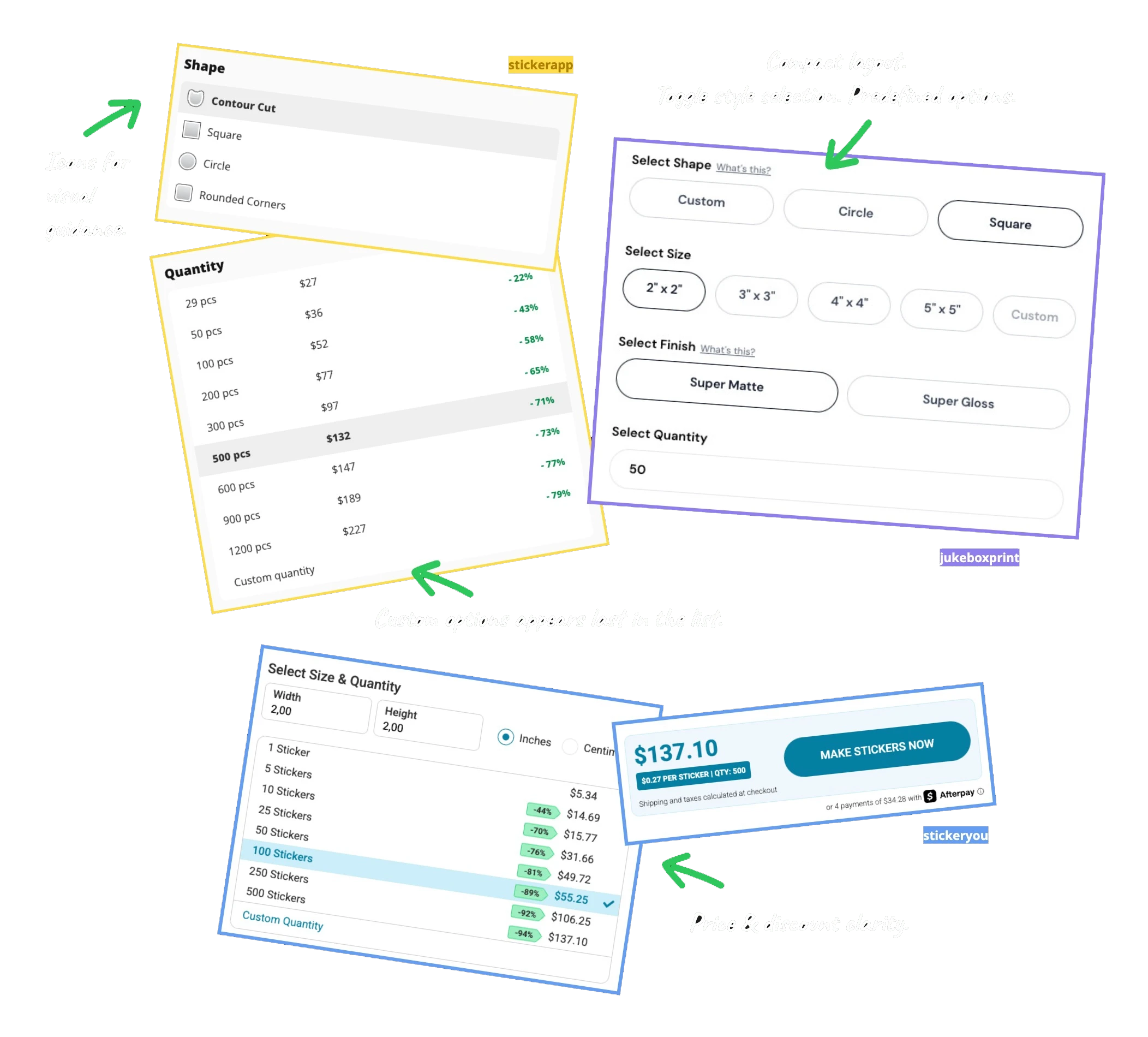
Other insights from our competitive audit:
Flow direction
Vertical flow is the standard in ecommerce.
Transparent pricing
Quantity selectors that display the unity price clearly (not just the total), were a recurring pattern among higher-converting calculators.
File support
Artwork guidelines and a direct contact option for file doubts appeared close to the upload step, reducing drop-off at the most friction-heavy moment.
Size flexibility
Predefined sizes work for most users, but offering a custom size is a pattern that appeared consistently across better performing shops.
Decision guidance
Recommendation tags (”most popular”, “best value”) were used to guide users toward decisions without overwhelming them with choices.
Trust signals
Quality signals like Fast Turnaround, Free Shipping, Weatherproof, Eco-Friendly Inks, Scratch Resistant, and Premium Materials were consistently placed near the CTA, not buried in product descriptions.
Each of these became an input for the decisions that followed in the design process.

ACT3 | THE PROCESS
Defining the scope
First-time customer
Doesn’t know variables yet.
Needs guidance and visual references.
Solution:
Pre-made starter packs.
Guided customer
Solution:
Pre-made niche packs.
Autonomous customer
Solution:
This calculator.
Choosing the layout
I wanted columns from the start. Every option visible and comparable at once, no endless scrolling. On desktop, that's perfect. On mobile, it falls apart. But the real reason was never technical:
People use each device differently, so the layout had to follow behavior, not screen size.
Comparing data from our website analytics, I found this:
The numbers backed it up: on desktop people stay 3x longer and place most of the orders. Data from the pre-redesign period (2025).

Why columns won on desktop?
Desktop is intentional. Someone sits down ready to configure. Columns feels like a real tool: everything visible, nothing hidden. And for a product this customizable, that confidence is what closes the order.
Why mobile stayed simple?
Mobile is discovery mode. People are distracted, comparing and rarely ready to buy in one go. The vertical flow rides the natural scroll: explore now, come back to order at a proper setup.
ACT4 | THE RESULT
Solution

Key design decisions

1.
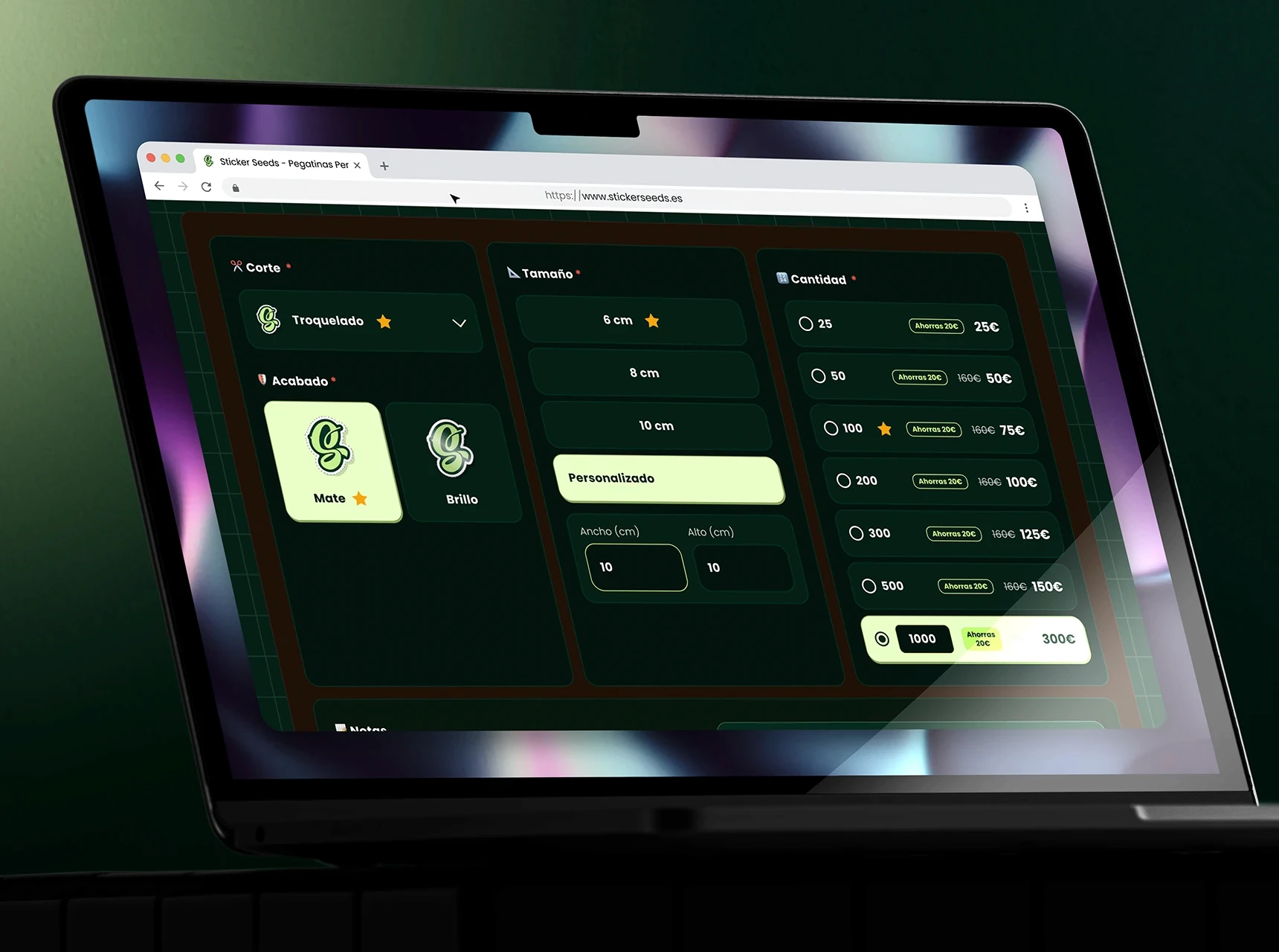
Replaced static dropdowns with a live preview that updates per change.

2.
Moved file upload to the last step to reduce friction at the discovery phase

3.
More clearly incorporated into the pricing process and order total.
Impact
+35%
Average order value on custom vinyl stickers, the calculator's primary product (€95 → €128).
Zero
Time to quote, replacing hours of manual back-and-forth.
+23%
Revenue from custom products, on 21% fewer orders. Fewer, larger purchases.
